
Here
is how the logo first started life as designed and hand drawn by Tony 'Captain
Jack Vincent' Rotherham
The second one is after John Webster ran it through
photoshop to tidy it up for the website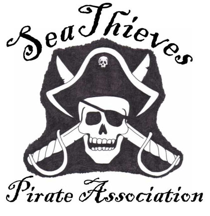
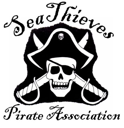
After
that, the background was made transparent and the lettering made white
An early
(failed) experiment
The final
version after running through photoshop, the gold/tarnished version was decided
on for the
website to match the colours but the silver one is still valid,
as is the original one at the top of the page
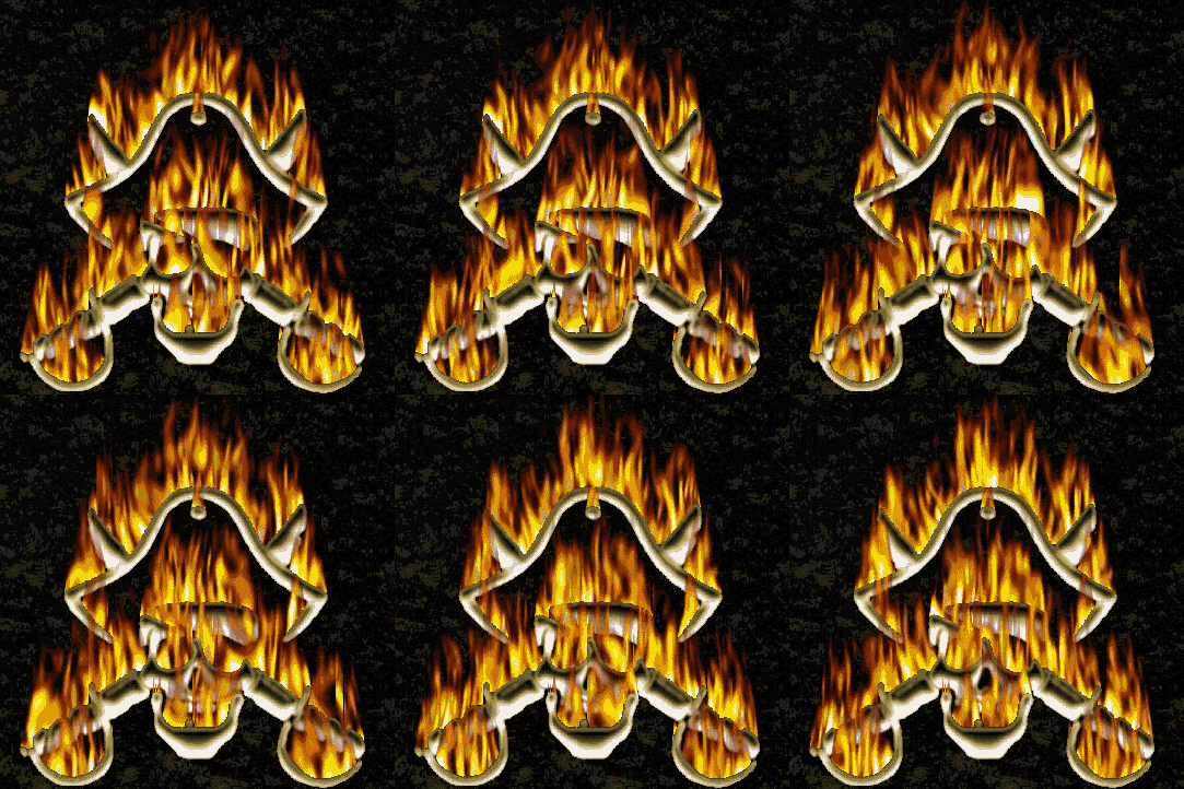
Then, just for fun I tried a few filters in photoshop like dripping and flames...
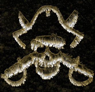
But the
hairy one below just has to be my favourite one for pure sillyness!!!